Jared

Remembering Summit Place Mall

Back in April, I started to feel Nostalgic for the former Summit Place Mall in Pontiac, Michigan. It had closed in 2009 and was finally demolished in 2019, so there are few ways for me to indulge my nostalgia apart from a handful of pictures posted online, and one or two urban explorer videos.

Like something out of a Chris Rock bit, Summit Place was arguably the less of Oakland County’s malls, with the Twelve Oaks Mall in Novi being the larger and more upscale of the two. Summit Place always felt much more comfortable to me, though. It could be that, by the time I was able to drive myself there, Summit Place was already in decline, which meant that crowds were lighter.


One of my earliest memories of Summit Place, is my father taking me and my brothers there to see the theatrical re-release of Disney’s Pinocchio, in 1984. In particular I remember seeing a trailer for a then-upcoming Disney film, that I couldn’t wait to see – The Black Cauldron.

…I wouldn’t get to see The Black Cauldron until its first home video release in 1998. By then I was a high school senior, and while I still liked animation, I found the film to be underwhelming.

Summit Place’s cinema – a separate building from the mall proper – closed in 1993, but wasn’t demolished until 2014. While it wasn’t the biggest cinema, I’d still held out hope that it might re-open. Instead, it was left to rot.


One thing that definitely made Summit Place better than Twelve Oaks, in my opinion, was that it had an arcade. Nestled in the corner of the foot court, it was THE place to experience the latest & greatest games, for a time. Teenage Mutant Ninja Turtles, Final Fight, Konami’s 6-player X-men, Street Fighter II (and all its revisions), Mortal Kombat, Darkstalkers… though if you were to ask my best friend, THE crown jewel of the arcade might’ve been the Ms. Pac-Man machine, near the entrance.

There always seemed to be one machine at any given time that drew a crowd. The 6-player X-Men game absolutely dominated the front right corner of the arcade, when it debuted. Street Fighter II and other subsequent fighting games attracted competitive players. In particular, there was always one guy – an Asian dude with hair down to his hips – that was practically unbeatable. He knew every move and combo for every character. With every new fighting game, players would line up their quarters at the bottom of the screen to challenge this guy, and nearly every one of them would walk away defeated.

Since this was the part of the mall I’d probably spent the most time in, I guess it’s oddly fitting that it’s also an area that I can now only glimpse in my memories. The arcade had closed well before the age of smart phones, and taking pictures at the mall was strictly forbidden in its heyday. To my knowledge no pictures of the arcade exist, and in the Ace’s Adventure video it’s boarded up.


The arcade was my only source of gaming memories. I always love to check out Babbage’s and Electronics Boutique, any chance I got. At least until I was working/driving age, I usually couldn’t afford to buy anything more than the latest issues of Electronic Gaming Monthly or Game Fan, but I like to see what was new on the shelves.

Electronics Boutique was where I feel I leveled up as a gamer, in a way – after the Sega Saturn was announced, I’d reserved mine there, and it was the first console I’d purchased with my own money. I was so nervous carrying it back to my car, afraid that someone might try to take it from me… although realistically, if someone had, they’d probably throw it back at me and beat my ass for not buying a Playstation.

One of my last memories of E.B., they had Sega Nomads on clearance for under $100. I did not have $100, and even if I had I probably wouldn’t have spent it on a system that was outdated even when it debuted, but now I think back and kick myself.


I can thank/blame one of the artists I follow, for triggering my mall memories. The pandemic got him pining for 90s-era malls, and so he’d built himself one as a VRChat world. My own nostalgia got me thinking a recreation of Summit Place could be fun, and if nothing else it might be something I could render my 3D characters in. But modeling the mall would be a crazy undertaking, seeing as the only reference I have are that Ace’s Adventures video, and a handful of interior photos.

…and 3D data ripped from Google Maps. Their 2D map is post-demolition, but they hadn’t updated their 3D view!

[ngg src=”galleries” ids=”3″ sortorder=”23,20,19,22,21″ display=”basic_thumbnail” thumbnail_crop=”0″]

Even if I only tried to model a portion of the mall – say, the food court – that would still be a huge undertaking. It certainly wouldn’t help that I tend to get obsessive, and would want everything to be accurate, down the size and spacing of the floor tiles… despite the fact that no one at this point would know if any of the details were wrong. Aside from the locations of certain stores, perhaps. My best friend could help me on that front – having worked at the mall for a few years, even know he likely knows its layout better than anyone.

Stores aside, if I structural accuracy remains important to me, I suppose I could see if I can’t purchase copies of the mall’s blueprints from the Oakland County Clerk’s office…

Another challenge to modeling the mall, in whole or in part, could be hardware or software limitations. While I was matching the extracted map to the scale of my Daisy model, Maya had slower to a crawl. This could be because the map is fairly dense and has a lot of redundant data, but I’ve also read that most 3D programs and game engines start to bug out when things move too far from the origin. And even at 1/10th scale, this mall mesh extend pretty far from the origin.
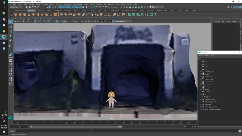

Now several months later, I’ve made no effort model any part of the mall. As fun as my nostalgia made the idea seem, it’s unfortunately a side project on an ever-growing list of side projects that I may never have time for. At best it might be something that I start, lose interest in, revisit several months or more later, and repeat…
Coverage

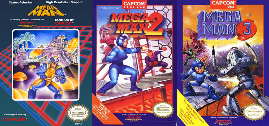
If you played video games in the U.S. in the 1980s or 90s, you’re probably no stranger to bad box art. You’re probably thinking of some examples right now – images that are over-rendered, poorly composed, with characters that look nothing like anything you’ll find in the game. And usually those characters will be posed in ways that look unnatural or very uncomfortable. Not only that, the characters’ faces are usually either angry, or look arrogant, like they either inspired or were inspired by the Disney/Dreamworks trend of a character smirking with one eyebrow raised. This is all what marketing executives at the time thought would make a game stand out on a shelf, and appeal to kids. Either that, or they just didn’t care, so long as the game sold well enough to fund their cocaine habits.

Perhaps one of the more notorious examples of bad box art, is Mega Man. The first game looks as if an executive with little or no drawing ability scribbled a concept, then handed it off to an amateur painter. By the third game, the cover art would start to more closely resemble the the original Japanese designs, but Mega Man would still look cocky and over-rendered. And RIPPED.

From doughy to six-pack abs in just three games!

By contrast, the Japanese covers were bright, cartoony, and appealing –

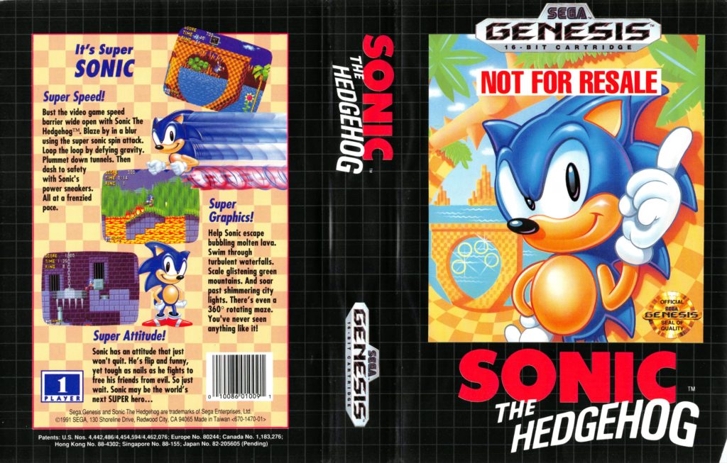
Over the past couple of years, I’ve start to collect games I used to own, and decided to make custom covers. It started with the Sonic the Hedgehog games. The cover art for the Sonic games in North America weren’t the worst, but they still suffered from the usual problems – over-rendered, mediocre posing, “attitude”, etc.. Granted, it fit Sega’s marketing campaign of Sonic being cooler/edgier than Mario, but something about the character always looked off.

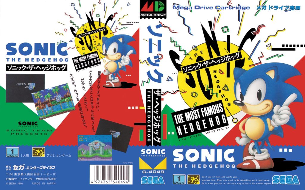
The Japanese cover was much simpler, by comparison, and yet busier at the same time.

also very, VERY 90s

Compared to the Japanese version, the American character art is just strange, to me. Sonic looks meaner, and his spikes are meant to look more like a mohawk, because ATTITUDE!

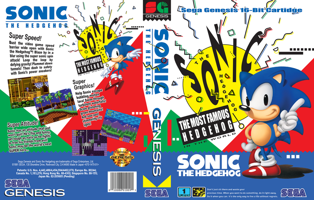
Since I find the Japanese cover to be much more appealing, I decided to copy it almost exactly –

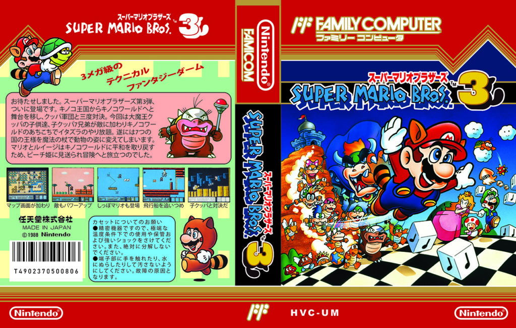
Once I was finished with my Sonic covers, I found others to work on. Visiting Japan in 2019, I picked up a few Famicom games for myself and my best friend, and figured those games could use covers as well. Famicom cartridges fit perfectly inside Sega Genesis game cases, but those cases are much bigger than the games’ original boxes. After adapting a Famicom template from The Cover Project, the first challenge was to find copies of the original art at a high enough resolution for printing. The second and perhaps bigger challenge, was finding clear enough pictures of the backs of the boxes, so I could scan the text with my phone. My goal was the make them look as authentic as possible.

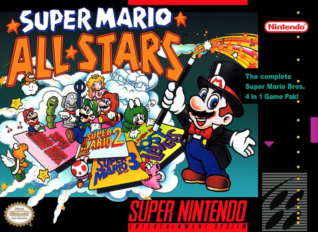
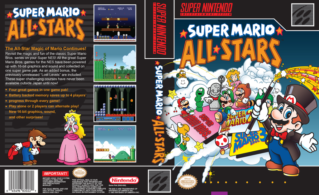
It didn’t take long for me to run out of Genesis & Famicom games to make covers for, so I turned my attention to the SNES. Probably the most difficult cover was Super Mario All-Stars.

This is a rare case were I think the North American box art is better than the Japanese version, but there was no way to fit it to a portrait-style layout. I needed to be able rearrange the composition, but couldn’t find any high-resolution source art to work with. To get the cover I wanted, I needed to recreate a good portion of it, starting with magician-Mario and the Bowser cloud. Most of the other characters had existing art that I could use, although frog-Mario was another that needed to be recreated… only to barely be visible in my final cover.

It isn’t just the front of the box that needs to pop, in my opinion. Most SNES covers are styled after the original boxes, which means most of the them use black as their background color. No matter how colorful the game’s logo might be, the black background makes them blend together. No one game is going to draw your attention, unless you’re up close. But with a wider spectrum of colors, every game screams out for your attention, even from across the room!

As I add more games to my collection, I’ll likely be making more covers as well. When they’re not being played, I want them all to look good on a shelf!

Check out some of my other covers below –

[ngg src=”galleries” ids=”2″ exclusions=”16,17,18,10″ sortorder=”16,17,18,10,6,12,11,9,8,13,14,7,15″ display=”basic_thumbnail” thumbnail_crop=”0″]

North and South (NES)

In the past year, I’ve started to collect games I either used to have as a kid, used to play frequently, or otherwise have fond memories of. North and South wasn’t a game I ever owned, but my brother Justin and I would rent it on a regular basis. Sometimes we’d have it for so long, I wonder now if it would have been cheaper if we’d just asked our parents to buy it for us.

The video store was a place called Entertainment Tonight, in Waterford, MI. “Like the TV show!”, we thought. It wasn’t the biggest store, though I remember it being twice the size of the place we’d previously rented from. And the previous place didn’t rent games. Blockbuster Video would be even bigger, when one eventually opened in our area.

Not too long before North and South was released, there was a mini series on TV by the same name. We thought that the game was based on the show, even if very loosely. I’d only find out, well, today, that the game was actually based off of the Belgian comic series Les Tuniques Bleues.

Playing the game, I want to say we would take turns playing one side or the other. I do know that we’d get a kick out of the south winning, regardless of who was playing. “That’s not how it happened!”

…And that’s all I can really remember about the game. Very little about the game itself, but a few loose, surrounding details. I did watch a play-through video, thinking it might job some memories, but… nothing. Granted, it’s been about 30 years since I played the game, and there’ve been many more games since then, that had a much bigger impact on me.

Still, this is a game I look at now, and wonder if I should add it to my collection. My memories of the game itself may be dim, but it could still serve as a sort of bookmark for that time and place. And seeing that there’s a remake on the Switch, I may have to let my brother know about it, if he has the system or plans on getting it for his son.

Frankenmuth Auto Fest 2021

The Frankenmuth Auto Fest is something of a yearly tradition, for my family. And at least for me, for too long it was the closest I’d get to a real vacation. I’m not much of a car guy, but I love seeing the variety of vehicles at these shows, accompanied by (mostly) good music. But as nice as the well-maintained or fully-restored cars are, sometimes it’s the rougher ones that catch my eye.

Seeing familiar faces is another positive aspect of the show. It might be the one time of year to see certain family members and friends, but there are also some familiar strangers I keep an eye out for. There’s an older fellow whose name I can never remember, but he seems to know everyone. Because of the pandemic, I was worried about whether he was even still around. I did see him on the second day, thankfully, though I didn’t have a chance to say hello.

Another familiar face – or rather, car – ended up being a no-show. Every year before 2020, there was a guy who’d take up 2-3 spots for his car, Coca-Cola signs, and a motorized bar stool with a pair of Truck Nutz hanging under the seat. This one I have mixed feelings about – back in 2016, I needed the show to be a break from the election, but this guy was the one person in the entire show who couldn’t leave his politics at home for a weekend. I won’t say it ruined my weekend, but it did sour my already gloomy mood. All of that aside, I was hoping to see his area at this year’s show. The bar stool is always good for a laugh! Fingers crossed he’s in good health, and can attend next year.

This year the show wasn’t quite as relaxing as I’d hoped, because I was set on recording video to cut together and share. I’m not a vlogger, and it’s been years since I’ve edited any video. I didn’t even know what to edit it with. Once I’d settled on a program – DaVinci Resolve – and gotten around the initial learning curve, it still took a few days just to render out the video I’d recoded on the second day –

A walking tour of the show grounds

While I was taking my tour, the DJ announce a fly-over as a tribute to 9/11 –

Later that day, we got to see the aqua cars in action, from across the river at the Frankenmuth Brewery-

Aqua Team Auto Force, Go!

The final day of the show is not quite as exiting as the first two days. Usually by the end of the second day, anyone who will be winning a trophy will know it. About half of everyone else will clear out during the Saturday night cruise, so they won’t have to deal with the traffic the next day. Once the sun is up on Sunday morning, the remaining cars steadily clear out.

so fewer cars…

Dreamworks’ Turbo

Some movies, you know exactly what to expect before it even starts. This was one of them. Story-wise, it wasn’t too bad, it’s just that most people over the age of 10 have seen it several times before. It’s derivative. Plus, from start to finish, I just didn’t care about the characters, or anything that was happening. I’m fairly easy to please when it comes to animation, but ultimately this film failed to be interesting.

One major knock against the film – the gags weren’t that funny. Part of this may be due to overexposure – all of the “good” jokes had already been used in the trailers, leaving little for the film itself. In fact, it felt as though the rest of the film was little more than filler – connective tissue between all the bits previously shown in the trailers.

Here’s one example of narrative failure: From the start, the film paints the top Indy 500 racer – Guy Gagne – as a good sport and an inspirational figure. And then – surprise – he ends up becoming the film’s villian. That is not a spoiler – nearly every trailer and tv ad had already spelled out very clearly that he’s the bad guy. The film goes through the trouble of setting up the switch, but it just doesn’t work because the entire audience already knows he’s a dick.

That really is my biggest complaint about the film – anything that might have been worth seeing had already been spoiled, thanks to the advertising. There really isn’t much more to see that can’t be predicted. From the trailers you already know Turbo dreams of being fast, gets his wish granted, gets found by some guy and introduced to a crew of racing snails, races in the Indy 500… And if you’ve seen any 5 average animated films from the last decade or so, you also know Turbo’s super-speed will eventually fail on him, but he’ll somehow manage to win the race without it, and maybe some sort of life-lesson will be learned along the way.

If anything, this film – or at least its epilogue – felt like it was paving the way for a tv show. Perhaps they should have skipped the high-budget feature, and produced a tv pilot instead. At least then its failure might not have been as much of a nut-punch to the studio.

As much as I didn’t care for the film, I felt it could have some redeeming value on video – I certainly have far worse films on my shelf as reference (looking at you, Ice Age series and Hotel Transylvania). After reading the short list of bonus features, I reconsidered this notion. Like the Croods before it, Turbo doesn’t appear to have any meaningful bonus features – no behind-the-scenes featurette (that doesn’t focus primarily on the voice talent); no “Animators’ Corner”, no audio commentary… Since Turbo and The Croods are the first Dreamworks films distributed by 20th Century Fox, I’m worried that this could be a pattern. On the other hand, this lack of extras has saved me from wasting money on an otherwise lackluster film.

Hands-on with the Surface Pro 2

If I could sum up the Surface Pro 2 in one word, it would have to be “disappointing”.

After purchasing the Surface and getting my software set up, I started to miss the simplicity of Sketchbook Pro on my Galaxy Note 10.1. One thing quickly became clear – the software I want to use isn’t designed for tablets. Maya and Zbrush weren’t so bad with screen scaling left at the default 150%. Photoshop, however, literally hurt my eyes – its UI looked absolutely tiny at 150%, smaller than Maya and Zbrush looked at 125%. A quick Google search revealed that Adobe’s software ignores Windows’ scaling.

At 10.6″, screen space is a commodity that cannot be wasted. As small as the UI elements seemed, they still took up too much valuable screen space. On a Cintiq, where you have a few programmable buttons, you could at least set up a hotkey to hide and unhide Photoshop’s UI, but the Surface only has one available hotkey – the pen’s side switch.

Pen accuracy was another issue – even after several attempts at calibration, the cursor always seemed to be slightly off from the tip of the pen, at least toward the center of the screen. It was slightly less accurate at the edges, but far worse at the corners. Even Wacom’s driver couldn’t fix this. The tiny UI elements didn’t help either.

And then there was a nasty bug when holding the tablet in portrait mode… seemingly at random, the cursor movement would be 90 degress off – moving the pen up would move the cursor right, right would move it down, and so on. I narrowed the problem down to the keyboard – the bug only seemed to happen if I was folding it behind the tablet. If the keyboard was forward or detached, the cursor moved properly.

I only had the Surface for a day before returning it. That’s how disappointed I was. The Cintiq Companion might be closer to what I’m looking for – larger screen, programmable buttons… But it’s also got a heftier price tag, and I worry that the screen may still be too small to work on comfortably. I’ve been waiting for years for a “perfect” artists’ tablet, I’ll just have to keep waiting.

Problems with Expressions

rose_wip24

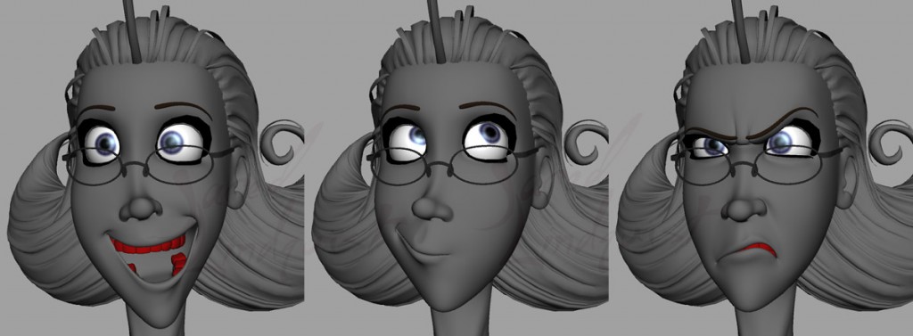
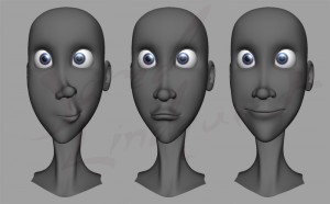
Rose’s face is proving to be a bit more trouble than I originally expected…

Some of her expressions require just a hair more know-how than I currently have, or have the patience for.  For example, I have it so her smile can be cranked up to 200% for a nice, Joker-like grin.  This requires another shape to move the nose up, but I hav no idea how this will mix with other nose shapes.  Her teeth and gums will also need to move, though I’m starting to think it’ll be better if I just don’t push her that far.


One annoying problem comes from her “mouth corner in” shapes – on their own, each of these will move the mouth to either side, along with the nose.  Combined – with the aid of a corrective shape – they form the “pucker” shape.  But when I move the sliders from 0 – 1, her nose shrinks and moves up at 0.5, only to return to normal at 1.  I tried to add another correction to compensate for this, but it only made things worse – now her nose shakes te 0.25 and 0.75.


But by far the biggest headache might be Maya’s expressions.  I’ve never used them much, and definitely not for faces – I’ve always preferrred to use utility nodes.  But I like the idea of only having a few expression nodes, rather than dozens or hundreds of utilities.  Figuring out the code to do the jobs of the utilities is a challenge, but not too difficult.  The real headache comes from Maya inexplicably mixing up my code – expressions that were working find before, and that I haven’t even touched recently, may suddenly drive the wrong shapes, or a control in an expression will be swapped out for another.  This could be a big problem, and I have no idea why it’s even happening.

Why the long face?

Taking a small break from modeling Rose’s facial expressions, I decided to get started on her & Daisy’s aunt Mercy –

rose_wip23

…who looks weird to me without her usual scowl.

Those final baby-steps

rose_wip20

Aside from shading, Rose is close to being complete – all that’s really left are her eyebrow blendshapes. I’m not very motivated to model them, though, because I’ve lost my kinda taste for pushing and pulling points. Fortunately Zbrush can be much faster, even if I’m not quite used to its interface yet.

rose_wip21

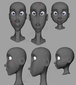
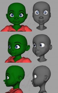
Something else I ended up doing out of boredom, was using Rose as a starting point for a new Daisy model. Unlike her old model, this time I made sure to use proper reference drawings –

Daisy_v2

It’s still rough, but it’s a start.

Hello, karma?

And here I was feeling so good about my bindPose tool. I had added some functionality that Maya’s dagPose command doesn’t seem to have. I pat myself on the back, job well done. Except it turns out the dagPose command is a little more complicated than I originally thought. It still doesn’t do what I need want it to do, but what it does do can be a bit… odd, depending on how you’re interacting with it.

One of the procedures I wrote over the weekend is meant to save out the member, parent, and worldMatrix values from a dagPose node to a mel file, so the node can be recreated in another file. But while testing it on Rose’s bindPose, I noticed that the values didn’t match up – some of the members would have no worldMatrix values, for example. Looking into this, things got weirder and more frustrating.

If I used `getAttr -size bindPose.members`, I would get a value of 302. Using `dagPose -q -members bindPose` would return a value of 246. A more brute-force method returned a value of 217. But if I loaded the node in the connection editor, there were 305 member slots, and they all appeared to have incoming connections. Even more confusing was that, while the getAttr command said there were only 302 members and parents, it said their were 305 worldMatrix entries.

What I’ve found out, is that even if you tell the dagPose command to store only specific objects, it appears to also store any objects above those, as well as their parents and worldMatrix values. But when queried via the dagPose command, these extra members are not returned. If at some point you reparent an object, and then delete the groups that were once above it, those objects’ connection to the dagPose node will obviously be removed, but their worldMatrix values remain.

For now, what appears to work is to use the `getAttr -size` command on all three attributes, then using the highest value to limit the loop that processes the objects. It’s a hack solution that I have a feeling will cause problems later, but for now it appears to work.